Product Planning
User Experience Research
User Interface
Illustrious tech blog
Mar 15, 2025
Used Tools | Illustrator, Adobe XD, Figma
Project Duration | 2025.01 ~ 2025.03
Team | 1 UI/UX Designer, 1 Graphic Designer, 3 Front-End Engineer, 1 Back-End Engineer
Role | UI/UX Design, Prototype Building, Product Planning
Project Overview
To create a brand identity that would resonate with a broader audience, our team set out to design a platform that others would not only use, but feel drawn to. Through collaborative brainstorming sessions and curated visual references, we aligned on a thematic direction centered around keywords like cosmic, nebula, celestial, and stardust. This universe-inspired aesthetic was chosen to reflect both our forward-thinking, tech-driven identity and the imaginative potential of our AI image generation work.
With a long-term goal of supporting ongoing development and research, we envisioned a tech-focused website for our brand, Illustrious. The platform was designed to serve multiple purposes: showcase our work, share insights, and invite sponsorship. As such, we structured the site around three key pillars—Landing, Blog, and Sponsor pages—each crafted to tell our story, share our journey, and connect with like-minded supporters.
Preliminary Research
To inform our design and content strategy, we conducted a comparative analysis of both international and domestic tech blogs. Our research revealed two primary models: self-hosted platforms and third-party solutions such as Medium. This helped us identify structural and functional patterns that could guide the direction of our own blog.
One key insight was the use of comment systems. Domestic tech blogs often allow comments, but typically through GitHub-based integrations and are mostly used internally within the company. In contrast, international tech blogs generally disable comments altogether. Given our positioning as an AI image generation company—where public dialogue can sometimes lead to unnecessary conflict—we concluded that it would be best to omit a comment feature entirely. This decision helps us maintain a focused and safe environment for sharing insights.
In parallel, we also researched existing sponsorship platforms like Ko-fi and GitHub Sponsors. These services offered valuable inspiration in terms of user experience and communication style, which we adapted to shape our own sponsorship page.
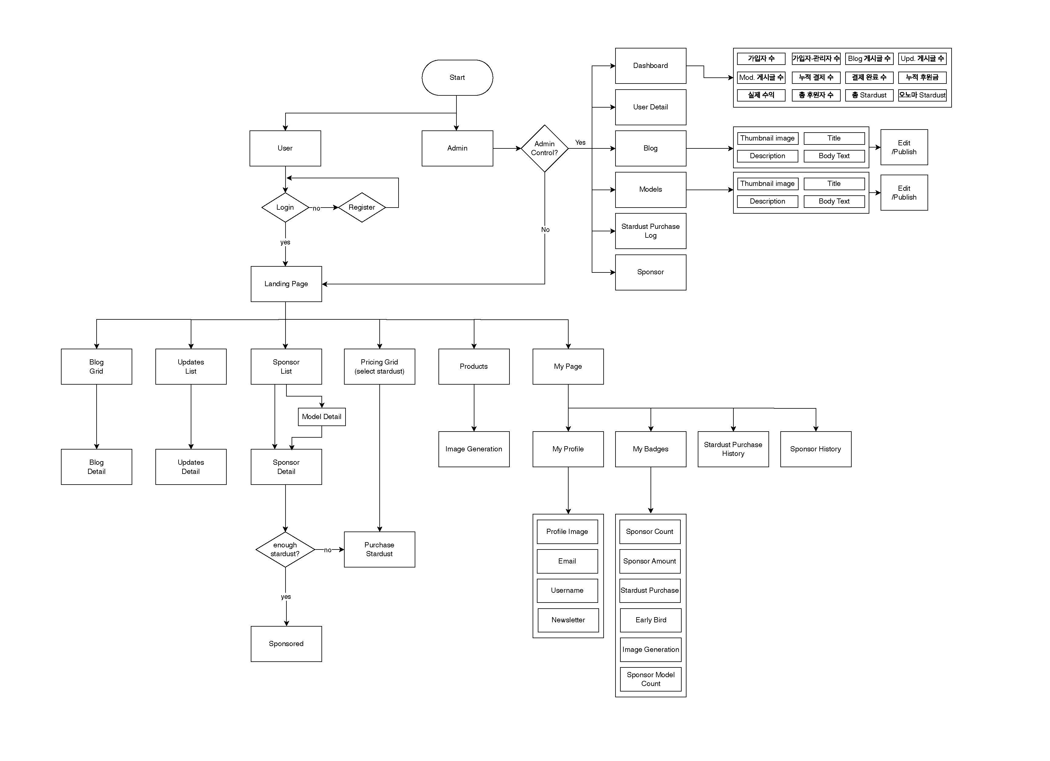
Flowchart
UI Design
Landing
The visual direction for the landing page was led by a collaborating graphic designer, who crafted the key visual elements. I focused on integrating these assets in a way that is both visually compelling and development-ready.

The layout begins with captivating title text, immediately followed by a dynamic image gallery that signals to users that this is an AI-powered image generation platform.
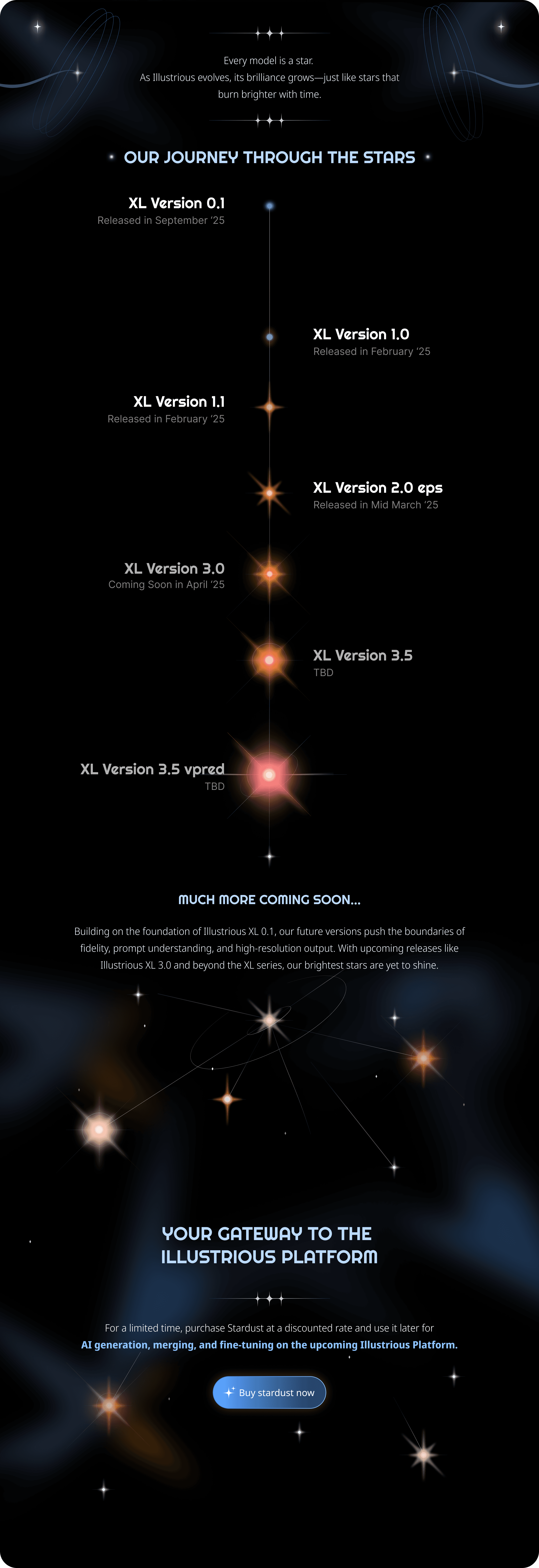
The visual flow aligns with our product’s narrative direction, symbolized through the evolution and growth of a star—a metaphor for creativity, innovation, and expansion. The page also hints at future developments, sparking curiosity and anticipation.
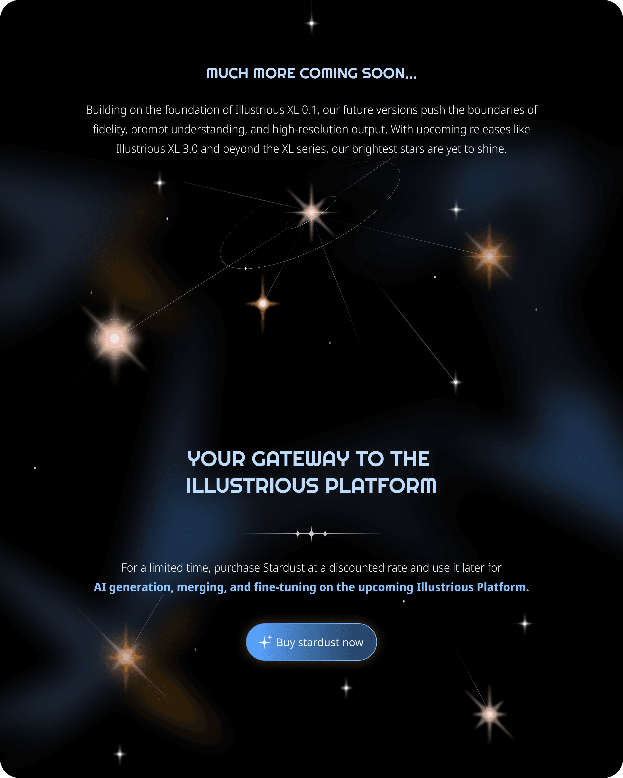
This journey naturally leads to a clear call to action, encouraging users to support the project through sponsorship.
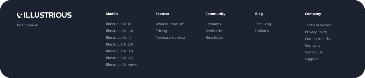
Finally, a well-structured footer section allows for easy navigation across the site, ensuring a smooth and intuitive user experience.
Blog/Blog Detail
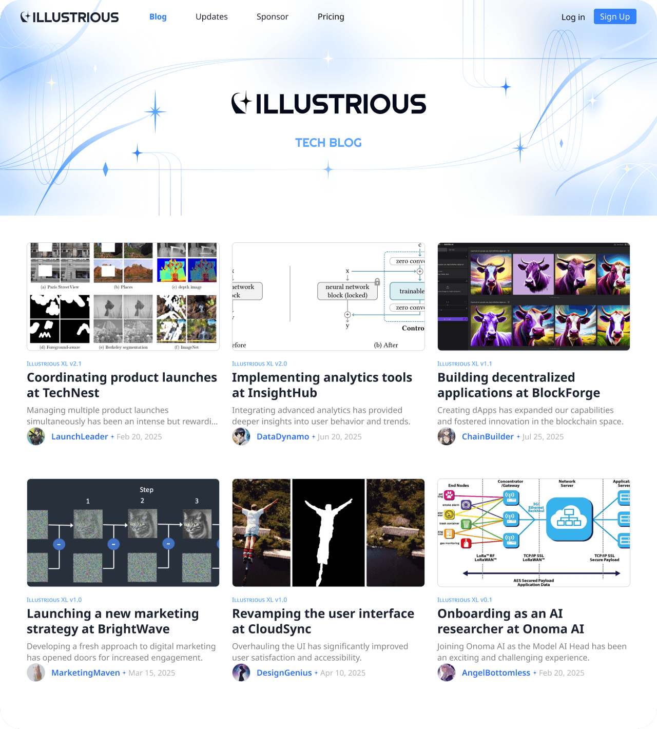
On the blog list page, I placed an aesthetic banner image at the top to instantly capture users’ attention and establish a strong visual identity for the blog section. Below the banner, posts are arranged in a grid layout, making the content feel approachable and well-organized for readers.
Each post preview highlights the AI researcher who authored it, bringing a personal, human-centered element to the platform and recognizing the individuals behind the work.

For the blog detail pages, I focused on creating a clean and reader-friendly experience. I carefully adjusted line height, heading hierarchy, and body text structure to make the content easy to follow and visually digestible. At the bottom of each article, a section suggests related blog posts, encouraging users to continue exploring similar content.
To further enhance readability and distinguish it from other areas of the site, the blog section uses a white background, creating a calm, focused environment optimized for reading.
Updates/Updates Detail
The Updates section shares a similar structure with the blog, particularly in the detail page layout, ensuring consistency across the platform. However, the list page format differs intentionally to reflect the nature of the content.

Unlike the blog, which uses a grid layout to feel friendly and editorial, the Updates page adopts a list format. This design choice conveys a more professional and organized tone, while also clearly highlighting the chronological order of posts—a key aspect for update logs.

Aside from the layout difference on the list page, the detail pages for Updates and Blog remain visually consistent, maintaining a unified reading experience throughout the site.
Sponsor/Model Detail
The Sponsor page was designed with a clear goal in mind: to encourage users to actively support the development of image generation models.

To achieve this, I implemented a card-style carousel that showcases each model through a thumbnail, model title, and brief description, followed by a progress gauge that indicates funding status—how much has been filled and what remains.
The carousel format allows for a concise yet engaging overview of both published models and those currently in development, giving users a sense of momentum and progress.
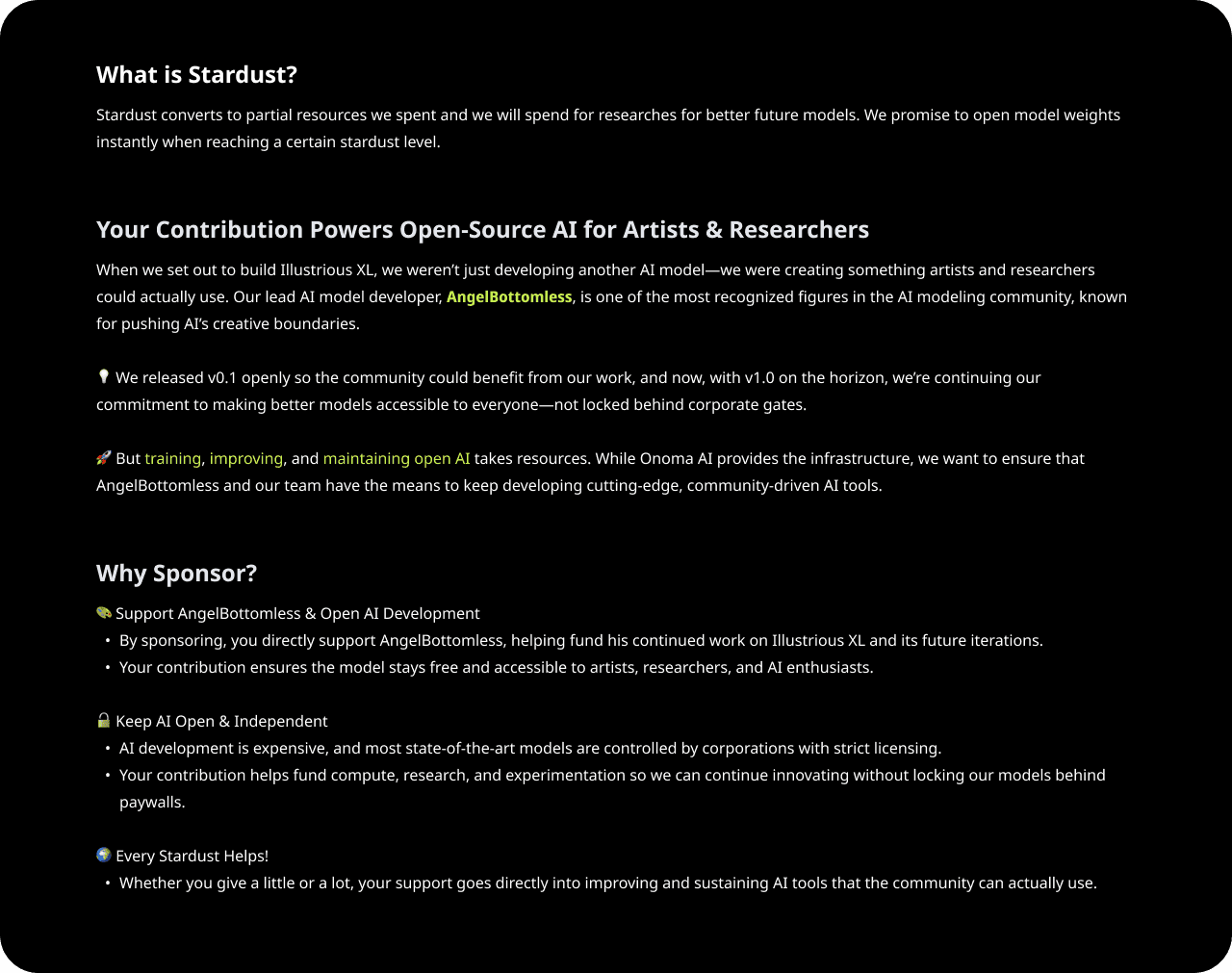
Beneath the carousel, a detailed explanation outlines the purpose of the sponsorship, helping users understand why their support matters and what impact it has.
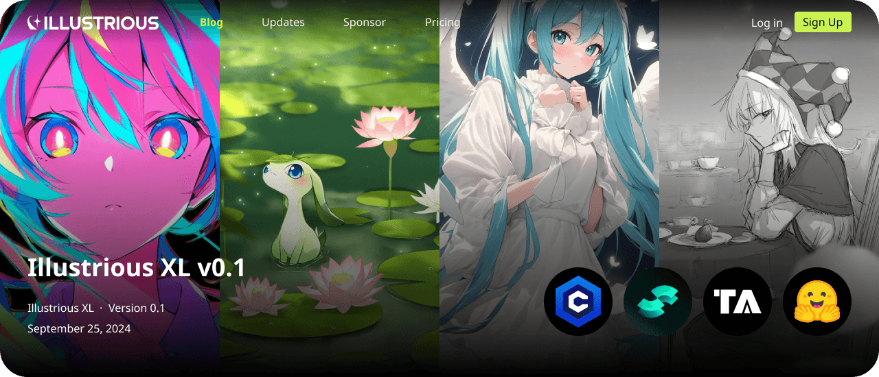
On the Model Detail page, the experience begins with a thumbnail preview of generation results, offering a visual showcase of the model’s capabilities. Above the image, we display the model name, version, and release date, followed by direct links to the model’s hub, allowing users to access or explore the model further.

The main content includes a comprehensive model description, while a dedicated sponsor panel on the right highlights the current funding status and offers a quick path to support. Each model is tied to its own sponsorship goal, allowing users to contribute to the specific technologies they are most interested in, and enhancing their sense of personal involvement and impact.
Retrospect
Collaborative Design Experience
This project was especially meaningful as I got to collaborate with a graphic designer, rather than handling the entire design process alone.
I focused exclusively on UI design, which allowed me to dive deeper into my core strength.
We shared ideas and built upon each other's work, leading to a stronger outcome.
I could delegate areas I wasn't fully confident in, and saw how trust in a teammate can result in great team synergy.
Developer-Friendly Mindset
With prior experience at the company and more autonomy in my workflow, I was able to approach the project with a broader perspective:
I understood the importance of balancing visual creativity with development feasibility.
As the connector between graphic design and engineering, I translated high-fidelity visuals into practical, buildable interfaces.
I began to think ahead about handoff challenges, particularly regarding responsiveness and layout behavior.
Responsive vs. Adaptive Design Lessons
Having struggled with responsiveness in previous projects, I tried to tackle it more proactively this time.
I defined max-width settings for large screens, but overlooked small-screen behavior, which led engineers to fill in the gaps.
While grateful for their support, the result didn’t fully align with my vision.
This taught me to set clear standards from the start—whether the design should be responsive or adaptive, and how that impacts handoff planning.
Page Width Considerations
Through research and experience, I gained insights into when to apply max-width constraints:
For interactive pages, allowing content to fill the screen often improves usability.
For informative or content-heavy pages, applying a max width enhances readability.
I plan to be more intentional with these decisions in future projects, tailoring layout behavior to the purpose of each page.